Article
The Psychology of Colour, Light & Performance at Work

Most offices are designed to look good. Very few are designed to work — at least, not for the human brain.
Because here’s what most people still miss: the colour of the walls, the quality of the light, the mood of the space—those aren’t just aesthetics. They’re levers. Pull them right, and you get sharper thinking, calmer teams, better work. Get them wrong, and you get friction, fatigue, and people who want to leave.
Let’s talk about what your workspace is saying to your brain — and how to make sure it says the right thing.
Design Is Strategy Wearing a Blazer
A visually appealing office might get compliments, but a high-performing office delivers results. The World Green Building Council reports that optimised work environments boost productivity by up to 23%. The University of Exeter echoes that—add greenery, art, natural light, and output jumps by 32%.
That’s not aesthetic indulgence—it’s corporate intelligence. The office is your brain’s environment. Treat it as such.
Colour Is a Cognitive Tool
Colour isn’t just visual—it’s visceral. It moves through your eyes straight to your nervous system, sparking reactions before your conscious brain even has time to catch up.
Here’s what every shade in your office could be doing to your team:
-
Blue
The poster child of corporate design—for a reason. Blue promotes calm, trust, and focus. It reduces heart rate and lowers cortisol levels, which is why it’s often used in high-concentration zones like strategy rooms, meeting pods, or private workstations.
Great for: Deep work, analytical tasks, spaces that need quiet cognitive stamina.
Use with: Natural textures or warm lighting to avoid feeling cold or detached.
-
Green
The colour of balance and restoration. Green is mentally refreshing, reduces fatigue, and—when connected with biophilic elements—can increase wellbeing and memory retention by up to 15%.
Great for: Breakout spaces, wellness zones, and quiet focus corners.
Use with: Natural light or wood tones to amplify the restorative effect.
-
Yellow
The bold optimist. Yellow triggers dopamine and enhances mood, energy, and optimism—but it’s volatile. In high doses or poor lighting, it can cause overstimulation and fatigue.
Great for: Creative thinking zones, idea rooms, or anywhere you want to spark joy. Use with: Restraint. Accent walls, not full immersion.
Use with: Restraint. Accent walls, not full immersion.
-
Red
Red says urgency. It increases heart rate and alertness. It’s stimulating—great for short bursts of focus or intensity, but counterproductive for calm or long-term work.
Great for: Sales zones, pitch areas, or spaces that benefit from high energy.
Use with: Caution. Too much red can elevate stress and tension.
-
Orange
A warm motivator. Orange combines the cheer of yellow and the energy of red. It’s known to increase sociability and enthusiasm, and it may even stimulate appetite and conversation.
Great for: Collaborative zones, informal lounges, internal cafes.
Use with: Cooler tones or neutral accents to avoid visual overload.
-
Purple
Purple is associated with creativity, luxury, and introspection. It’s not common in workspaces, but when used well, it lends spaces a thoughtful, slightly unconventional energy.
Great for: Innovation labs and creative lounges.
Use with: Minimalism. Purple gets loud fast.
-
White
Often used as a ‘safe’ default, white creates a sense of space and cleanliness. But used excessively, it can feel sterile, cold, and mentally fatiguing—especially under fluorescent light.
Great for: Pairing with bold accents or to frame colour-heavy environments.
Use with: Texture, contrast, and warm lighting to bring depth.
-
Grey
Sophisticated, but risky. Grey is calming, neutral, and sleek—but can veer into dull and depressive, especially without contrast. It can also suppress creative thought if overused.
Great for: Minimalist design, formal meeting rooms.
Use with: Warm woods, colour accents, and human-centric design to soften the edge.
-
Black
Underused, but powerful. Black communicates power, sophistication, and clarity. It absorbs light and can anchor a space—but too much can feel heavy or closed in.
Great for: Details, accents, or high-contrast design.
Use with: Reflective materials and plenty of light to avoid a cave effect.
-
Beige & Taupe
Subtle and safe—but often psychologically underwhelming. These shades feel warm and soft but can induce mental fatigue or disengagement if not paired with texture or colour contrast.
Great for: Soft backgrounds, natural palettes, understated elegance.
Use with: Plants, lighting layers, and richer tones to keep things dynamic.
Light Is a Performance Enhancer (or a Killer)
Light isn’t just what lets you see. It’s what tells your brain what to be. Awake, alert, sleepy, anxious, stable — all of it depends on the kind of light your body’s taking in.
Natural daylight, in particular, is a cognitive superpower. A Cornell study found that natural light reduced eye strain by 84%, headaches by 63%, and drowsiness by 51%. Meanwhile, circadian-responsive lighting—lighting that shifts colour temperature and brightness in sync with your body’s clock—helps regulate melatonin and improve mental alertness throughout the day.
But when lighting is wrong, the effects are noticeable—and costly. Artificial light in the evening can delay melatonin release by 90 minutes, impacting mood, sleep, and memory. Poor-quality fluorescents and screen glare actively suppress morale and drain energy.
Bottom line? The wrong lighting dims more than the room—it dulls the people in it.
Small Tweaks, Major Uplifts
You don’t need a full renovation. Here’s what works—fast:
| Intervention | Benefit |
|---|---|
| Layer lighting | Combine ambient, task, and natural light to reduce eye fatigue |
| Tunable LEDs | Synchronise lighting with natural rhythms to boost mood and focus |
| Colour zoned areas | Cool tones (blue/green) promote focus; warm accents (yellow/red) boost energy |
| Biophilia (add plants) | Adding plants can increase memory and engagement by 15%; green signals care and wellbeing |
| Control given to users | Personalising lighting and layout increases productivity by 25% |
Sometimes, the biggest ROI comes from the smallest change.
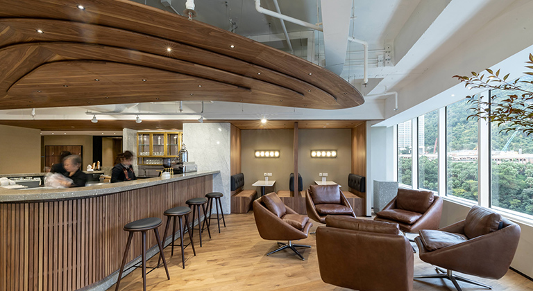
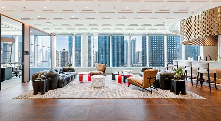
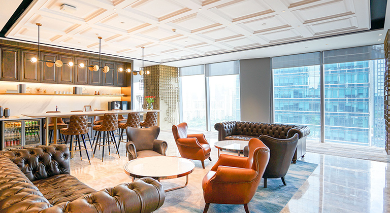
How We Think About Space at The Executive Centre
We don’t just design for what looks good in photos. We design for what feels good in your head.
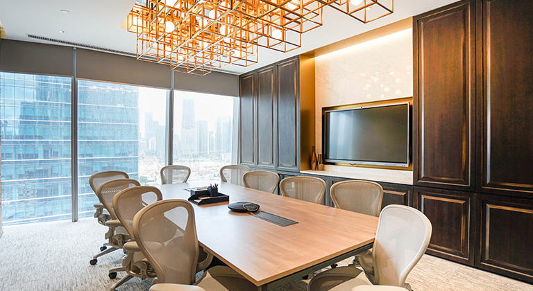
- Colour with Intent: Our palettes aren’t aesthetic guesses—they’re psychological tools. Cool hues in Private Offices ease cognitive load. Warmer tones in lounges and breakout areas support collaboration and ease.
- Natural Light First: Wherever possible, we maximise natural light. Where it’s not, high-quality, glare-free lighting keeps minds alert and moods steady.
- Bringing Nature In: From greenery to wood textures to organic materials, biophilic design threads through our spaces—adding not just beauty, but cognitive calm and restoration.
- Space That Breathes: Many of our centres offer panoramic city or harbour views. Not just a luxury—these are mental refresh points, giving your brain the break it didn’t know it needed.
- Choice Is Power: Wherever possible, we give you control to tailor your space—light, layout, air—because what works for one brain doesn’t work for all.
So, Maybe It’s Your Walls
If your team is burned out, distracted, or disconnected, it’s not just the workload—it might be the walls. Because design isn’t just for decoration. It’s behaviour-shaping. Mood-setting. Culture-defining.
So next time you wonder why the energy in your workspace is off, don’t look at the people first. Look at the space.
And if you’re ready for a workspace that works for your brain—not against it—you know where to find us.


